Unsupervised Learning is used to detect anomalous behavior that deviates from the norm. It can be applied to identify emerging cyber threats that are not yet known. It can analyze the behavior of an average customer at a specific point in time or the average behavior of a customer over a period of time.
Quote
An outlying observation, or outlier, is one that appears to deviate markedly from other members of the sample in which it occurs.
- Grubbs (1969)
It’s relevant in scenarios where:
- Organizations are initiating fraud detection efforts and have no labeled historical data.
- There is a lack of labeled historical data for fraud detection purposes.
- Fraudsters are constantly evolving their tactics and techniques.
Defining the average behavior or norm can be difficult depending on the application field. The line between what is considered normal and what is considered an outlier is not always clear-cut, because fraudsters often try to blend in with normal behavior. Additionally, the concept of what is considered normal may change over time. Analytical models used for fraud detection must be continuously monitored and updated. It’s important to note that not all anomalies necessarily represent fraud. Unsupervised learning for fraud detection requires thorough validation of any suspicious observations that are identified.
Ideal tools for exploring data and gaining initial insights include histograms and box plots for identifying one-dimensional outliers, as well as scatter plots for detecting outliers in two or three dimensions. However, these methods have limitations as they are less formal and only applicable to a limited number of dimensions. Additionally, they require active involvement from the end-user. When dealing with large-dimensional datasets, these tools can become cumbersome to use.
Statistical Outlier Detection
Statistical methods are used to detect outliers in a dataset. The most common methods include:
- Z-Score: Observations with a z-score absolute value greater than 3 can be considered outliers.
- Fitting a distribution or mixture of distributions: Outliers are observations with low values for the probability density function.
- Break-Point Analysis
- Peer-Group Analysis
Break-Point Analysis
Tip
Break-point analysis is a method used for detecting intra-account fraud. It identifies sudden changes in account behavior.
- Define a Time Window: Choose a fixed time period for analysis, such as one month. This window of observation is critical as it provides a manageable segment of time to analyze and compare account behavior.
- Segment the Time Window: Divide the selected time window into two distinct segments:
- Old Segment: This is the initial part of the time window, used to establish a baseline of normal account behavior.
- New Segment: This is the latter part of the time window, where new account activities are observed and analyzed.
- Compare Behavior Patterns:
- Baseline Establishment: Analyze the behavior patterns in the Old Segment to understand the typical usage, transaction frequencies, amounts, and other relevant metrics.
- Deviation Detection: Evaluate the behavior in the New Segment against the established baseline. Look for significant deviations or unusual activities that were not present in the Old Segment. These deviations could indicate potential fraud or irregular activities.
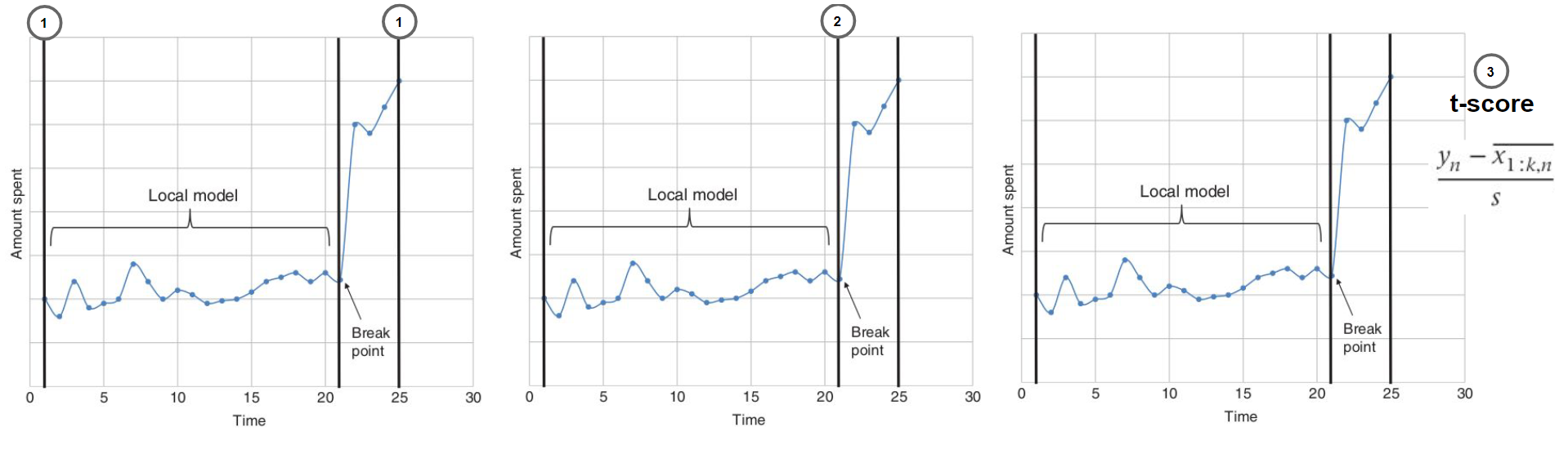
Break-point analysis is commonly used in financial institutions to monitor and detect suspicious activities, including fraudulent transactions, unusual account behavior, and potential breaches of account security. It is also applicable in other fields where monitoring of behavioral changes over time is critical, such as in cybersecurity and operational risk management.
Peer-Group Analysis for Inter-Account Fraud Detection
Inter-account fraud detection is a critical component of financial security, involving the identification of fraudulent activities by comparing the behavior of a target account against a group of similar accounts, known as a peer group. The core idea is that accounts exhibiting similar behaviors under normal circumstances should maintain consistency, and any significant deviation from this consistency may indicate fraudulent activity.
The first step in peer-group analysis is the identification of a peer group — a set of accounts that are expected to behave similarly to the target account. Two primary approaches can be used to establish these peer groups:
- Business Knowledge-Based Approach: This method leverages domain-specific expertise to manually group accounts that are expected to exhibit similar behavior patterns. For example, in a banking context, accounts of customers with similar demographics, transaction volumes, or account types might be grouped together based on historical insights and business rules.
- Statistical Similarity-Based Approach: This approach utilizes mathematical and statistical techniques to measure the similarity between accounts. Commonly, metrics like Euclidean distance, Manhattan distance, or cosine similarity are used. These metrics assess how closely the behaviors of two accounts align across various dimensions, such as transaction frequency, transaction amount, or the types of transactions conducted. For example, Euclidean distance computes the straight-line distance between two points in a multi-dimensional space, where each dimension represents a different behavioral feature.
Selecting the appropriate number of peers in the group is crucial to the effectiveness of fraud detection:
- Small Peer Groups: If the peer group is too small, it may be overly sensitive to noise. This sensitivity can lead to false positives, where normal account behavior is incorrectly flagged as fraudulent.
- Large Peer Groups: Conversely, if the peer group is too large, it may become too generalized, diluting the sensitivity to local anomalies. This can result in false negatives, where actual fraudulent activity is missed because the group’s overall behavior averages out individual deviations.
The goal is to find a balance where the peer group is large enough to establish a robust behavioral pattern but small enough to remain sensitive to anomalies specific to the target account.
Once the peer group is established, the next step is to analyze the behavior of the target account in comparison to its peers. This analysis can be performed using various statistical tests and distance metrics:
- Statistical Tests: Techniques such as Student’s t-test can be employed to compare the means of the target account’s behavioral metrics against those of its peer group. The t-test helps determine if the differences in behavior are statistically significant, potentially indicating fraud if the target account’s behavior deviates significantly from the norm established by its peers.
- Distance Metrics: Mahalanobis Distance is another powerful tool for detecting anomalies. Unlike Euclidean distance, Mahalanobis Distance accounts for correlations between variables and the variability within the peer group. It measures the distance between the target account’s behavior and the mean behavior of the peer group, normalized by the covariance of the group. A high Mahalanobis Distance may indicate that the target account’s behavior is an outlier, suggesting potential fraudulent activity.
Credit Card Fraud
Consider a weekly amount time series:
where is the amount spent at time . The goal is to detect anomalies in the amount spent at time .
- Identifying the k peers of the target account.
- Behavior comparison
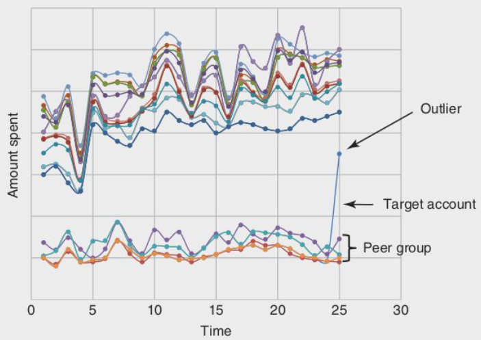
Advantages and Disadvantages of Peer-group and Break-point Analysis
Peer-group analysis focuses on inter-account behavior to track anomalies, while break-point analysis looks at intra-account behavior. One advantage of peer-group analysis is its ability to detect local anomalies. On the other hand, break-point analysis is effective at identifying changes in spending patterns over time. However, both methods may not be as effective in detecting global anomalies.
Clustering
Clustering is a fundamental technique in data analysis used to group a set of observations into clusters where observations within each cluster are highly similar to each other, while observations in different clusters are more dissimilar. To achieve effective clustering, the goal is to enhance the homogeneity within each cluster and maximize the heterogeneity between clusters. This approach helps in uncovering patterns and identifying anomalies by grouping similar observations together.
- Data Selection: When preparing data for clustering, it is essential to consider both structured data (like numerical and categorical data) and unstructured data (like text or images). A larger dataset generally improves clustering results, but it is crucial to manage the quality of data by avoiding excessive correlations. Feature selection techniques can help by identifying and retaining the most relevant features, thereby enhancing the clustering outcome.
- Clustering in Fraud Detection: In the context of fraud detection, the focus is often on identifying anomalies that deviate from normal patterns. Clustering can be particularly useful for grouping these anomalies into small, distinct clusters based on their similarities. This approach aids in recognizing specific patterns and behaviors indicative of fraudulent activities.
- Distance Metrics: To cluster observations effectively, a distance metric is used to quantify how similar or dissimilar observations are. The choice of distance metric depends on the type of data being analyzed:
- Continuous Data: Common distance metrics include:
- Euclidean Distance: Measures the straight-line distance between two points in a multi-dimensional space. It is suitable for continuous variables and assumes a Euclidean geometry.
- Mahalanobis Distance: Takes into account the correlations between variables and scales the distance according to the variance-covariance matrix of the data. It is useful for identifying outliers in multivariate distributions.
- Minkowski Distance: A generalization of Euclidean and Manhattan distances, parameterized by a value
. When , it is Euclidean distance; when , it is Manhattan distance.
- Categorical Data: For categorical variables, different metrics are employed:
- Simple Matching Coefficient (SMC): For binary variables, it counts the number of identical matches between pairs of observations. This metric treats all matches equally, making it suitable for binary comparisons.
- Jaccard Index: Measures similarity between two sets by considering the presence or absence of specific values. It is calculated as the ratio of the intersection to the union of the sets, making it useful for comparing the similarity of binary attributes.
- Continuous Data: Common distance metrics include:
graph TB
    A[Clustering]
    B[Hierarchical]
    C[Agglomerative]
    D[Divisive]
    E[Non-hierarchical]
    F[k-Means]
    G[Self-Organizing Maps]

    A --- B --- C
    B --- D
    A --- E --- F
    E --- G
Hierarchal Clustering
Definition
Hierarchical clustering is a technique in cluster analysis that creates a nested structure of clusters. It follows a bottom-up approach, beginning with each observation as its own cluster and progressively merging the closest clusters together.
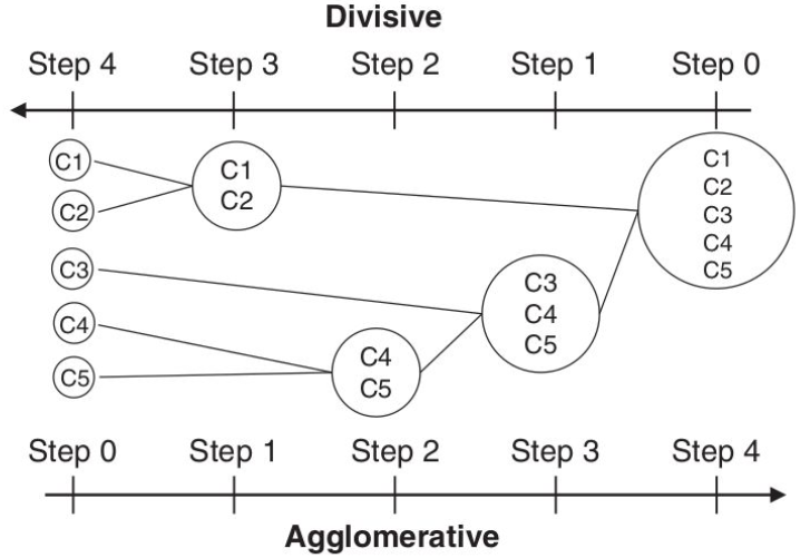
The distance between clusters is calculated using a linkage method. The most common linkage methods are:
- Single Linkage: The distance between two clusters is defined as the shortest distance between any two points in the two clusters.
- Complete Linkage: The distance between two clusters is defined as the longest distance between any two points in the two clusters.
- Average Linkage: The distance between two clusters is defined as the average distance between all pairs of points in the two clusters.
- Centroid Method: The distance between two clusters is defined as the distance between their centroids.
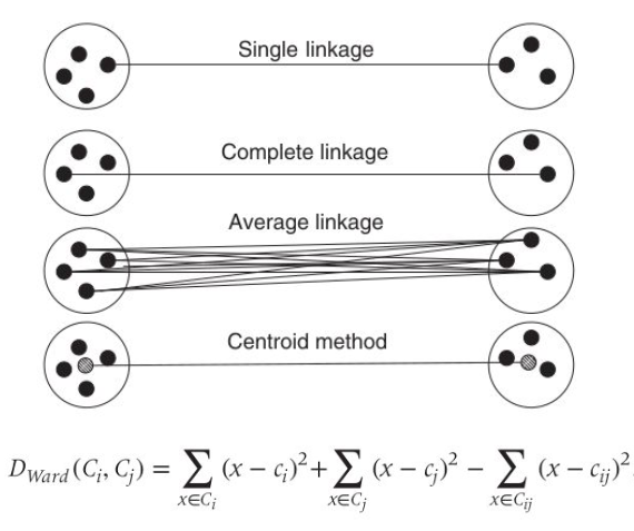
To determine the ideal number of clusters in hierarchical clustering, two commonly used methods are dendrogram analysis and the screen plot.
Definition
A dendrogram is a tree-like diagram that visually represents the sequence of cluster merges during the hierarchical clustering process. It shows how individual data points are grouped into clusters and how these clusters are further combined. The height at which two clusters merge represents the distance between them, with larger distances indicating less similarity. To identify the optimal number of clusters, one can “cut” the dendrogram at a level where there is a significant gap in height between merges, suggesting a natural separation in the data.
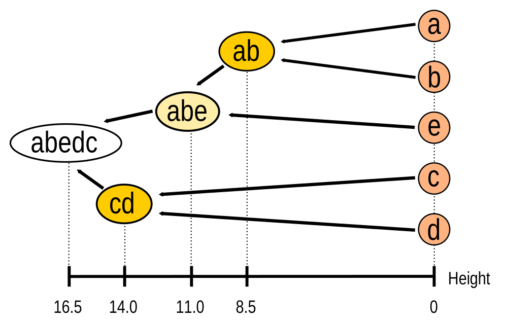
The scree plot is another method for determining the number of clusters. This plot displays the distance at which clusters are merged, with the distance plotted on the y-axis and the number of merges on the x-axis. The key feature to look for in the screen plot is the “elbow” point, where the rate of decrease in distance starts to level off. This elbow point indicates the optimal number of clusters, as it represents a balance between having too few clusters (which may oversimplify the data) and too many clusters (which may overfit the data).
Example
Consider the following data set:
X Y A 4 4 B 5 8 C 7 5 D 8 5 E 11 5 F 2 7 G 1 3
- Single Linkage
- Complete linkage
- Average linkage
- Centroid Method
- Ward’s method
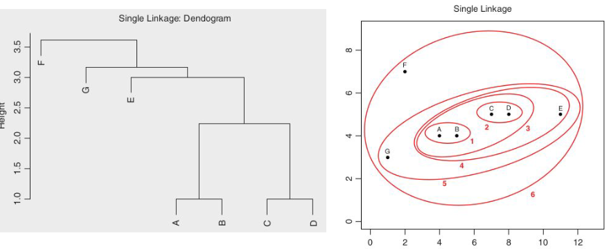
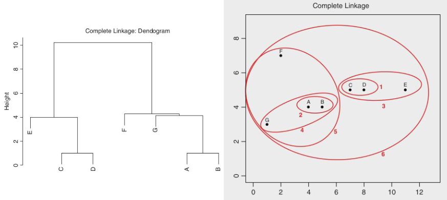
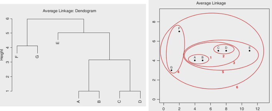
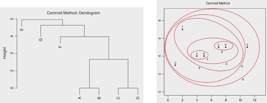
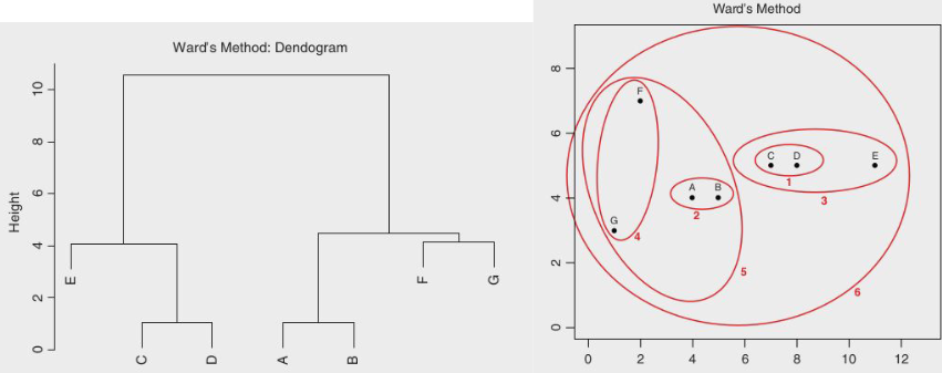
| Advantages | Disadvantages |
|---|---|
| The number of clusters does not need to be specified prior to the analysis | Do not scale very well to large data sets |
| The interpretation of the clusters is often subjective and depends on the business expert and/or data scientist. |
Non-Hierarchical Clustering
Definition
Non-hierarchical clustering is a method of cluster analysis that does not build a hierarchy of clusters. It is a top-down approach that starts with a single cluster containing all observations and then divides the cluster into smaller clusters.
k-Means Clustering
Definition
k-Means clustering is a popular method for partitioning a dataset into
distinct groups, or clusters, based on the similarity of observations. This clustering technique is widely used in data analysis and machine learning to identify patterns within data.
The steps of the
- Initialization: Select
initial centroids, which are the starting points of the clusters. These centroids can be chosen randomly from the dataset or using other heuristics. - Assignment: Assign each observation in the dataset to the nearest centroid. The “nearness” is typically measured using a distance metric such as Euclidean distance. Each observation belongs to the cluster whose centroid is closest to it.
- Update: After all observations have been assigned to clusters, recalculate the position of each centroid. This is done by computing the mean of all observations assigned to each cluster. The new centroid positions are the averages of the points in their respective clusters.
- Iteration: Repeat the assignment and update steps iteratively. The algorithm continues until the centroids no longer change significantly or a pre-specified number of iterations is completed. This iterative process helps in converging to a stable set of clusters.
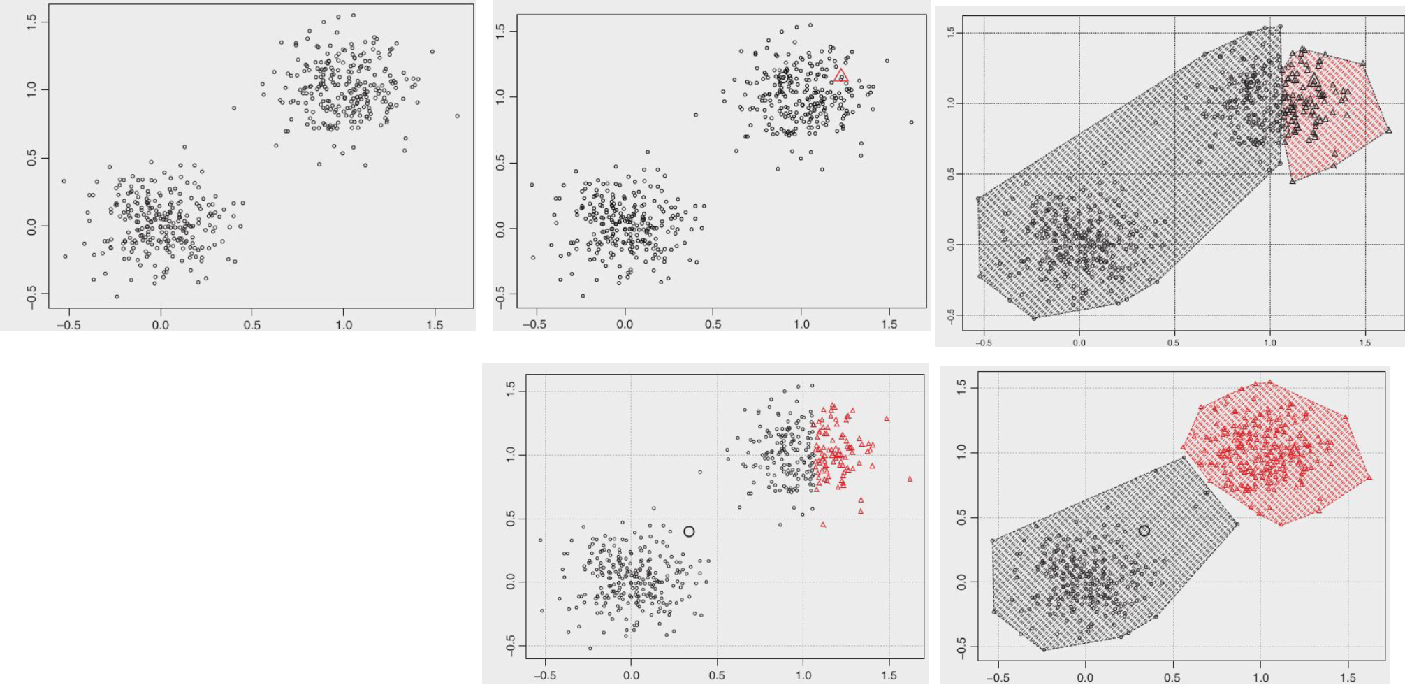
The analysis requires specifying the number of clusters,
- Input from Experts: Domain knowledge can guide the selection of
by suggesting a reasonable number of clusters based on the nature of the data. - Results from Other Methods: Techniques like hierarchical clustering can provide insights into a suitable number of clusters by creating a dendrogram, which can be analyzed to determine
. - Evaluation with Multiple
Values: Run the k-Means algorithm with different values of and use metrics such as the silhouette score or within-cluster sum of squares (WCSS) to evaluate the clustering quality. - Testing Different Seeds: Since k-Means is sensitive to the initial placement of centroids, testing various random initializations helps assess the stability and robustness of the clustering solution.
In cases such as fraud detection, where outliers can heavily influence cluster centroids, k-Means may not perform well. Alternative approaches like k-Medoids clustering, which uses medians instead of means to define centroids, can be more robust in handling outliers. For datasets with categorical variables, k-Modes clustering is an adaptation of k-Means that uses the mode instead of the mean for centroid calculation.
Evaluating and Interpreting Clustering Solutions
Evaluating the effectiveness of a clustering solution is not a trivial exercise and there is no universal criterion to determine its quality. However, from a statistical perspective, one commonly used measure is the Sum of Squared Errors (SSE). In this measure,
When comparing two clustering solutions, the one with the lowest SSE can be considered as a better solution.
In addition to quantitative measures, it is also important to visually explore the data and compare the distributions of clusters with the population distributions across all variables. This can be done on a cluster-by-cluster basis, allowing for a graphical comparison of the cluster distributions. This visual analysis can provide valuable insights into the effectiveness of the clustering solution and help in interpreting the results.
Self-Organizing Maps (SOM)
Definition
A Self-Organizing Map (SOM) is an unsupervised learning algorithm that allows users to visualize and cluster high-dimensional data on a low-dimensional grid of neurons. It is a feedforward neural network with two layers: an input layer and an output layer.
In a Self-Organizing Map (SOM), the output layer consists of neurons organized in a grid-like structure, which can be either rectangular or hexagonal. Each arrangement has distinct advantages:
- Rectangular Grid: This is the more common configuration. It is easier to interpret and analyze because of its straightforward layout. The number of neurons in this grid is determined by the complexity and dimensionality of the data being processed. The user typically selects this number based on empirical testing and the specific requirements of the data.
- Hexagonal Grid: Although less common, a hexagonal grid can be more efficient. It requires fewer neurons to cover the same input space compared to a rectangular grid. This efficiency arises because hexagonal grids minimize the distance between neighboring neurons, which can enhance the map’s ability to capture intricate patterns in the data.
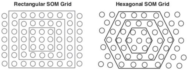
In both types of grids, neurons in the output layer are connected to the input layer via weighted connections. These weights are crucial for the learning process, as they are adjusted during training to represent the data effectively.
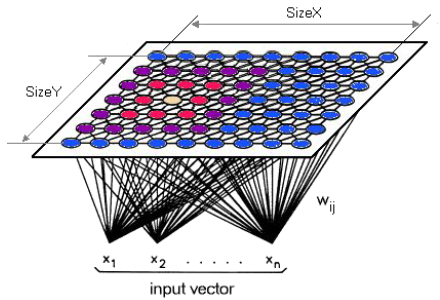
The SOM learning process involves the following steps:
- Initialization: Each input vector is connected to every neuron in the output layer through weights. These weights, denoted as
, are initialized randomly, where represents the number of input features or variables. - Distance Calculation: When a training vector
is presented, the Euclidean distance between and each neuron’s weight vector is computed. This distance is given by: where denotes the weight of neuron for the th input variable. - Best Matching Unit (BMU): The neuron whose weight vector is closest to the input vector
(i.e., has the smallest Euclidean distance) is identified as the Best Matching Unit (BMU). - Weight Adjustment: The weights of the BMU and its neighboring neurons are adjusted according to:
where represents the current time or iteration in the training process, and is the neighborhood function that determines the influence of the BMU on its neighbors. This function decreases over time and distance from the BMU, allowing for a finer adjustment as training progresses. - Training Duration: The training process continues until the BMUs stabilize or a pre-defined number of iterations is reached (commonly
times the number of neurons in the SOM). Over time, as the learning rate and neighborhood radius decrease, the map stabilizes, reflecting the underlying data structure more clearly.
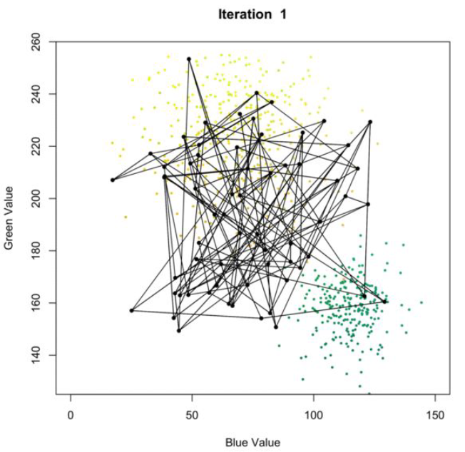
SOMs offer several visualization techniques to help interpret the clustering results:
- U-Matrix: The U-matrix visualizes the average distance between each neuron and its immediate neighbors. By assigning a height dimension to this distance, the U-matrix generates a color-coded map. Darker colors typically indicate larger distances, while lighter colors suggest smaller distances. This visualization is useful for identifying cluster boundaries and understanding the overall structure of the data.
- Component Plane: This technique visualizes the values of each input variable across the neurons. It helps in understanding how different input attributes contribute to the output neurons, providing insights into the relative importance of each variable in shaping the map’s structure.
Both visualization techniques — U-matrix and component plane — are powerful tools for interpreting the results of SOM analysis. They provide intuitive, visual representations that facilitate the understanding of clustering results and the data’s inherent patterns.
One-Class SVM
The goal of One-Class SVM is to maximize the distance between a hyperplane and the origin. This allows for the separation of the majority of observations from the origin. Outliers, which are observations that lie below the hyperplane and are closest to the origin, will return a positive (negative) value for the function